At last January’s MidWinter Convention, I was amazed at how quickly the Pugmire playtesters gravitated to the small bits of setting info available for the playtest. Specifically, the first tenet of the Code of Man: “By a good dog.” During the course of several hours, the playtesters uttered, snarled, shouted, and whispered that phrase as their characters explored the world of Pugmire. Sitting in the bar afterwards, like you’d expect, it hit me that a series of characters tied to the various ways we could express “Be a good dog.” would make great teasers for the upcoming game.
Fast Eddy Webb, our intrepid developer and creator, and I batted around some of the possible lines, and at the same time he sent me over brief descriptions of the signature characters he had already created. We added in a couple of the playtest characters that made better matches for our teaser lines, and I went to work creating character sheets for each of the six characters we intended to have appear in the six posters. Here is the description Eddy sent me for Sister Picassa Collie, who was matched to the version of the phrase we intended to lead with, “Be a GOOD dog!”:
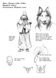
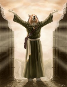
Sister Picassa CollieDescription: She wears shepherd’s robes, which are simple and shapeless. Her fur, however, is well-groomed, and a luxurious brown and white mix. She often brushes her fur to make sure it is perfect. When travelling, she carries a messenger-style bag: the strap rests across her chest, and the bag hangs at her side.
From that description, and having had the chance to play a Shepherd in the playtest, I was able to work up this character sheet for her:
Now, a style sheet or character sheet is a reference document to hand out to the artists (at least to start with) that covers the important visuals for the character. I try to work out a color scheme for their clothes and possessions (and fur), and to present them in a typical pose that evokes a bit of character. So they are pretty much what we know at the time, and could change by the finished project.
What Eddy and I discovered during the creation of these sheets was that they provoked all sorts of questions we needed to answer to build the world. For example, Sister Picassa was clearly connected to the Church of Man, so what sort of religious symbolism would these dogs have for their church? The “simple and shapeless” description of her robes suggested that at least some of them would be more like monks or other wandering clergy. But, Eddy also notes that she is not always on the road and takes the time and effort to keep her fur well-groomed. That suggests to me that she is humble but still connected to the world of nobles and courts. So her sash and bag are of finer make.
And then we have the resolution of something Eddy and I had been discussing for quite a while, the primary symbol associated with their church. As creatures uplifted by mankind, I liked the idea of the hand of man as a symbol. I played around with versions of the famous “finger of God” from the Sistine Chapel, but wasn’t satisfied. Gesturally, nothing felt right until I turned the fingers down and included the orb in the palm. Perhaps they are giving the dogs the world, the all, even some versions could make it a sun symbol in the palm. In any case, it became something that could be simplified to a strong symbol, or made as baroque and ornate as Gothic crosses were in our world; which gave it the range we wanted for the world of Pugmire. Now our shepherd had her religious icon to wear, her holy symbol to brandish.
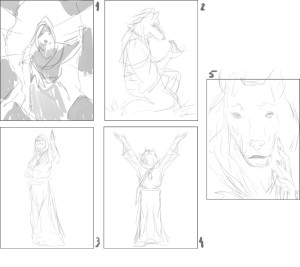
With the character sheet ready, I contacted my old friend, artist Claudio Pozas, whom I got to know during White Wolf‘s forays into the d20 Sword and Sorcery books. He has been steadily working and always striving for greater and more significant projects like his work in D&D 5th Edition, so naturally he jumped at the chance to work on Pugmire! Visually, Claudio represents a fairly realistic style that is comfortably within the existing fantasy gaming aesthetic. Just right to start off with. Here are his first sketches, just thumbnails to give me an idea of some directions he could go in:
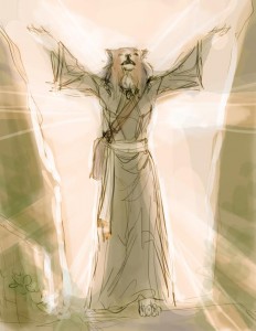
The two ideas from Claudio’s thumbnails that I really liked were the pose of the figure in #4 as I wanted a full body illustration and I could picture that sort of benediction pose with “Be a GOOD dog!”, and the effect of the light streaming in from behind her. I let Claudio know that and got this in return:
At this point my only concern was making sure the rocks and background didn’t seem too much like natural formations. There were other illustrations planned for this series that were about exploring natural environments, but this one was about her being in some sort of ruins. Plus, I didn’t want her to appear like a druid or other nature oriented religious figure. Claudio started working up the actual piece at this point, and began playing with his color palette:
Things were looking good to me, and I told him to keep going.
Only a couple of concerns at this point, like adding in some ivy to the walls and being careful that her fur color and robe color didn’t shift too far away from the expected because of the atmospheric color. At this point I passed this version to Eddy to be sure he was cool with it. He was.
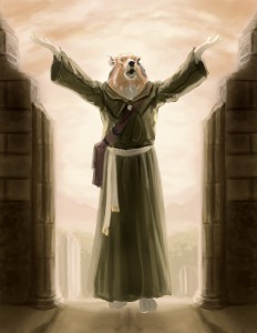
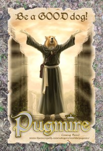
Claudio sent in the final, and I took that and set it into Photoshop as a layer in a file I had already created. I used a photo of some muddy ground to refer back visually to the Pugmire graphic we’ve been using on the Onyx Path website: https://theonyxpath.com/category/worlds/pugmire/ as the background. Then I bought some art paper and manually ripped and bent the edges to suggest old parchment to evoke the fantasy-medieval setting as well as to provide a common visual grounding for the all six posters, since I had always planned on all six artists doing the illustrations to have very different styles. Then I scanned in the paper and tweaked its settings to get the feeling I wanted and set a subtle drop shadow behind it to suggest that it was actually in the same world as the background.
I manually blurred the edges of the art to conform to the rips in the parchment, and as an added visual element so the edges weren’t merely faded, I duplicated the art, put the duplicate behind the original and enlarged it slightly, and made it mostly transparent. Just to give a hint of a sort of watermark of the image on the edges. Eddy and I had discussed what additional text info we wanted on the posters and settled on a simple “coming soon” teaser and the website address for the Pugmire setting page. So I added the tagline, the Pugmire logo I’d created a month or so earlier, and the minimal text we’d agreed on. And here it is all together:
You can get this as a free PDF, and as a print on demand poster for 99 cents at DriveThruRPG.com: http://www.drivethrurpg.com/product/148516/Pugmire-Poster-01
We’ll be releasing five more Pugmire posters in the next couple/three months that will give further peeks into the world through the art of five different artists depicting five more characters with different appropriate catch-phrases, so keep an eye out for them.
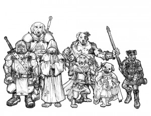
And as a teaser to these teasers, let’s wrap up with a line-up I made comparing the sizes of the characters we currently are working with in Pugmire:

Hm. Seven sigs… does that mean one of them’s not getting a poster?
Rex Pyrenees, who I included because I wanted him to be the example of the tallest character so far, and because he is featured in some of the writing Eddy has done.
I am so very excited to see the artwork from Pugmire!
Be a Good Dog!
You’re going to love the next one with Sgt Leo Bulldog-
I’m very happy with how this is coming along.
Thanks- good to hear!
This is so fantastic and wonderful. I am seriously pumped for this game!
Cool! Glad you think so and are getting excited-
I always say that artwork adds a lot to a game, conveying a feel and tone beyond the text. Its good to know that so much time is being taken over the artwork for Pugmire, and with such thought going into it I am sure that this will be an outstanding game!
I am one excited RPer!
These early pieces will be what we use to communicate the look and feel to other artists, and like I mention in the blog, Eddy and I actually settled a lot of questions during this process. It’s been pretty important in the worldbuilding of all my projects that needed that phase: Exalted, all three original Trinity settings, Scion, Scarred Lands.
Needs a corgi character!
We haven’t even started to populate the art for the book itself. Just wait and see all the different breeds we get in there!
I’m a little intrigued by the implication that a Collie, as a shepherd breed, would be a cleric, and so on. If so, I already have concepts based on my German Shepherds: the all-bark-no-bite priest, and the sweet but air-headed nun!
🙂
I love this ! im not sure where my lab who looks like she is wearing a tuxedo would fit in, but im going to find out. 🙂
I think the “hand of man” works for a lot of reasons! The orb makes me think of playing fetch with a ball, and I can easily imagine “bite not the hand that feeds” being one of the church’s teachings.
I wonder what the squeeky toy or smelly rope toy will be to them. Perhaps some sort of high level item or something, as my girl loves them. Especially the annoying squeeky toy.
on Nat Geo Wild Barkweek ! starts and it’s a 3 day event all about Dogs, and might be some good info for Pug. http://channel.nationalgeographic.com/wild/
This sounds like an amazing game, and I can’t wait to see it completed. If I had some fan art that I wanted to give to you guys, how would be the best way to do so?